The importance of color in branding
When talking to clients about logos and branding, color is often one of the first elements to come up. There’s no doubt that color is crucial for brand presence, recognition, and communicating what your brand is all about. But exactly what each color communicates can vary by experience, context, and even cultural factors. Some colors do broadly signify a specific trait; purple represents sophistication and charm, red is daring and exciting. So maybe bright red isn’t the best bet for the look of a new calming spa and salon, but it’s worked out quite well for Netflix and ESPN.
Because of the variability of how a color is perceived, it’s much more important that we use colors to support a brand, rather than trying to make a stereotype fit. For example, blue is known to signify reliability and trustworthiness, but if your competitors all seem to be floating in a sea of blue logos, it may make more sense to tailor another color to your brand presence to represent those characteristics and make yourself stand out.
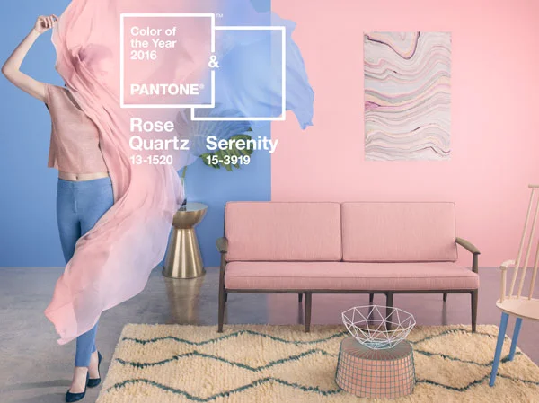
The authority on color across a variety of industries is Pantone, who provides color systems and technology for accurate communication of color. Each year, they pick a “color of the year” which usually becomes the start to a trend through fashion, design, and even home décor. 2016 is the first time they’ve chosen two colors of the year: rose quartz and serenity, a pale pink and blue.
These colors were consistent with colors found in Spring 2016 fashion, and many other consumer-oriented companies used them to help guide their designs and planning for 2016 products. Following and understanding changes in color trends can be quite profitable for many brands, whether it’s creating products to sell or using these colors in ad campaigns to attract the attention of consumers.
Someone that knows a thing or two about the importance of color is shoe designer and entrepreneur Vanessa L. Seide. In 2012, Vanessa founded Very Lovely Soles, a footwear company focused on beautiful, comfortable, and timeless flats that are handcrafted in Italy. We asked Vanessa about the vital role that color plays in the inspiration and execution of the VLS brand:
My whole collection starts with color. I can't imagine or start any of my collections with out it. For instance, I am working on my Spring/Summer 2017 collection, and I envision bright colors since I am heading to Africa this fall. I want my collection to represent this journey. I don’t yet know what materials I will use, but I can tell you I want bright colors: oranges, yellows, greens etc. I hope the customer’s mind will naturally see these colors and can somehow imagine they are on this trip with me.
When I see bright colors I get happy instantly, I’m excited, and it makes my mood so positive. I look for these bright colors to help me with all of my collections. I feel if I have these colors in my line, people will want to have these shoes as part of their wardrobe.
Color has a major affect on us; from the car we drive to the color we paint certain rooms in our homes. I think about color every day when creating my collection. How could I not?
Whether it’s the colors we wear, or the colors we see in everyday brands and products, it’s important to recognize that the psychology of color plays a key role in marketing and branding. Color can change our mood, and the mood of potential customers. Consumers aren’t driven completely by logic when making purchase decisions – emotion plays into those decisions, and color can help drive emotion. No color is universal in its meaning, so it’s key to understand and use the meaning of colors to support the message you want to convey for your brand.
